The Reykjavik City Planning Project
Planning Books
Web App Design
Background
To address the growing urban density problem, the city wanted to update its urban planning process and move context to neighborhoods rather than arbitrary plots. They wanted to create a self-service information system to make official planning more accessible to the public.
The challenges
-
✰Serving 3 different types of user:
- ✳City Employee
- ✳Professional (i.e. architects and engineers)
- ✳Civilian
- ✰Improve and simplify workflows, both in-house and outsourced
- ✰Create a robust and consistent visual language so materials created by firms would carry the same message
- ✰To make complex information readable to laypersons
- ✰Turn an outdated system, with massive amount of information-dense documents (Excel files) into accessible and usable data
Standardizing the
Planning Posters
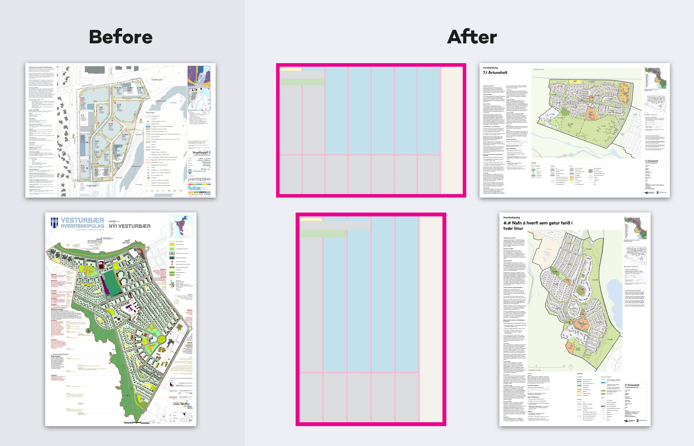
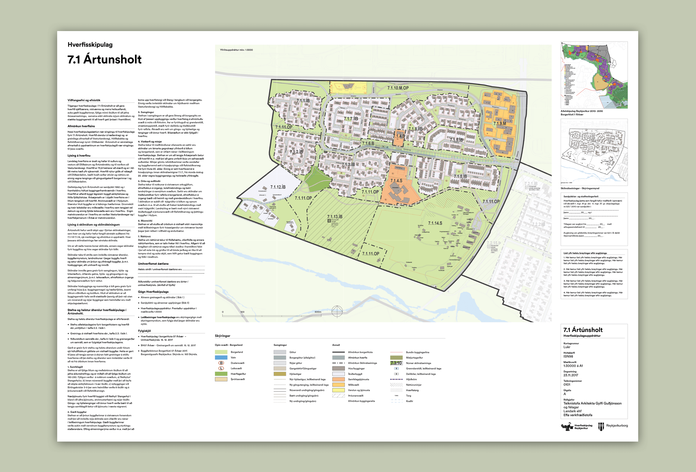
Our first step was improving the planning posters—complex, information-heavy maps that had no standards or guidelines for visual design. Instead, each architecture and engineering firm created their own poster, with their own styles.
Ox communicated with engineers working for the city to better understand their process and tools. We focused on simplicity and readability, and took into account the more broad-stroke (but legally binding) styles from the planning level above, creating visual styles that felt part of the same process.
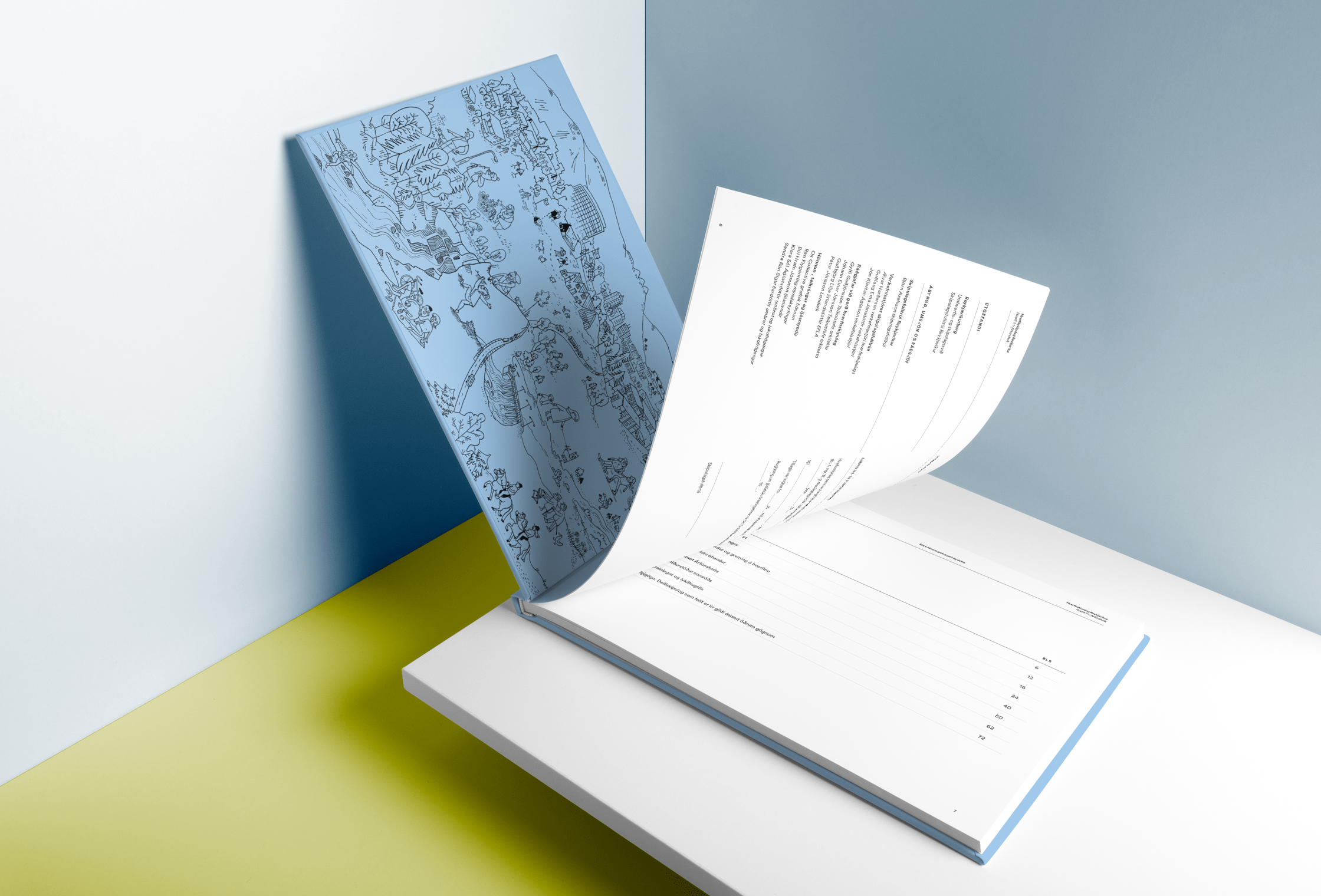
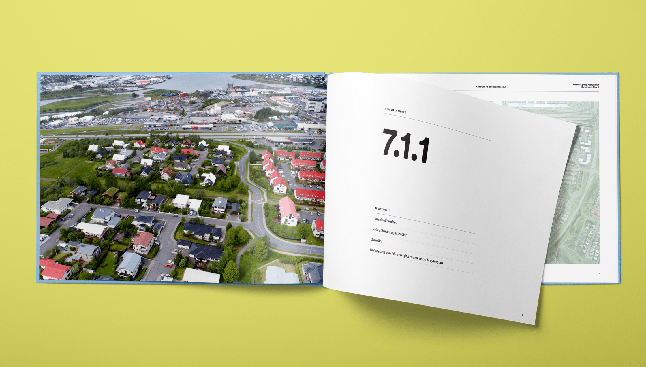
Redesigning the Planning books for scalability and collaboration
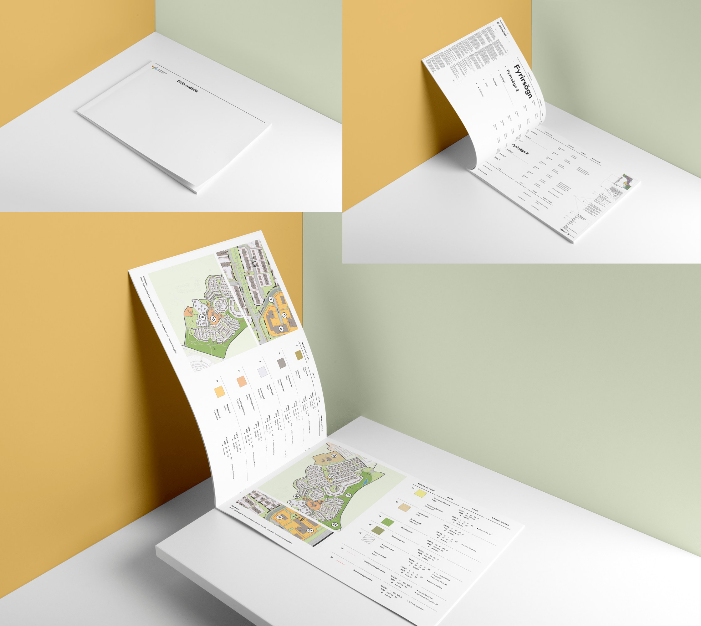
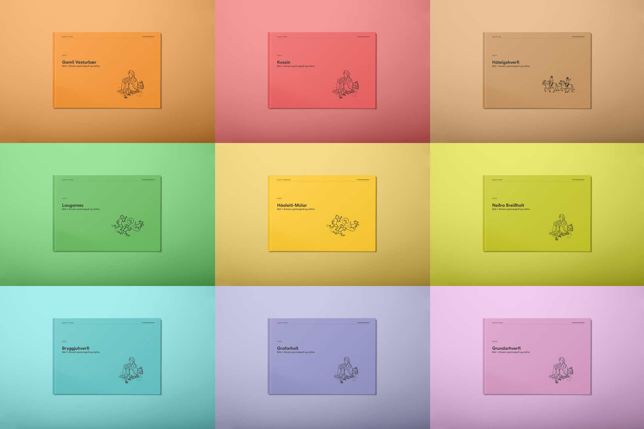
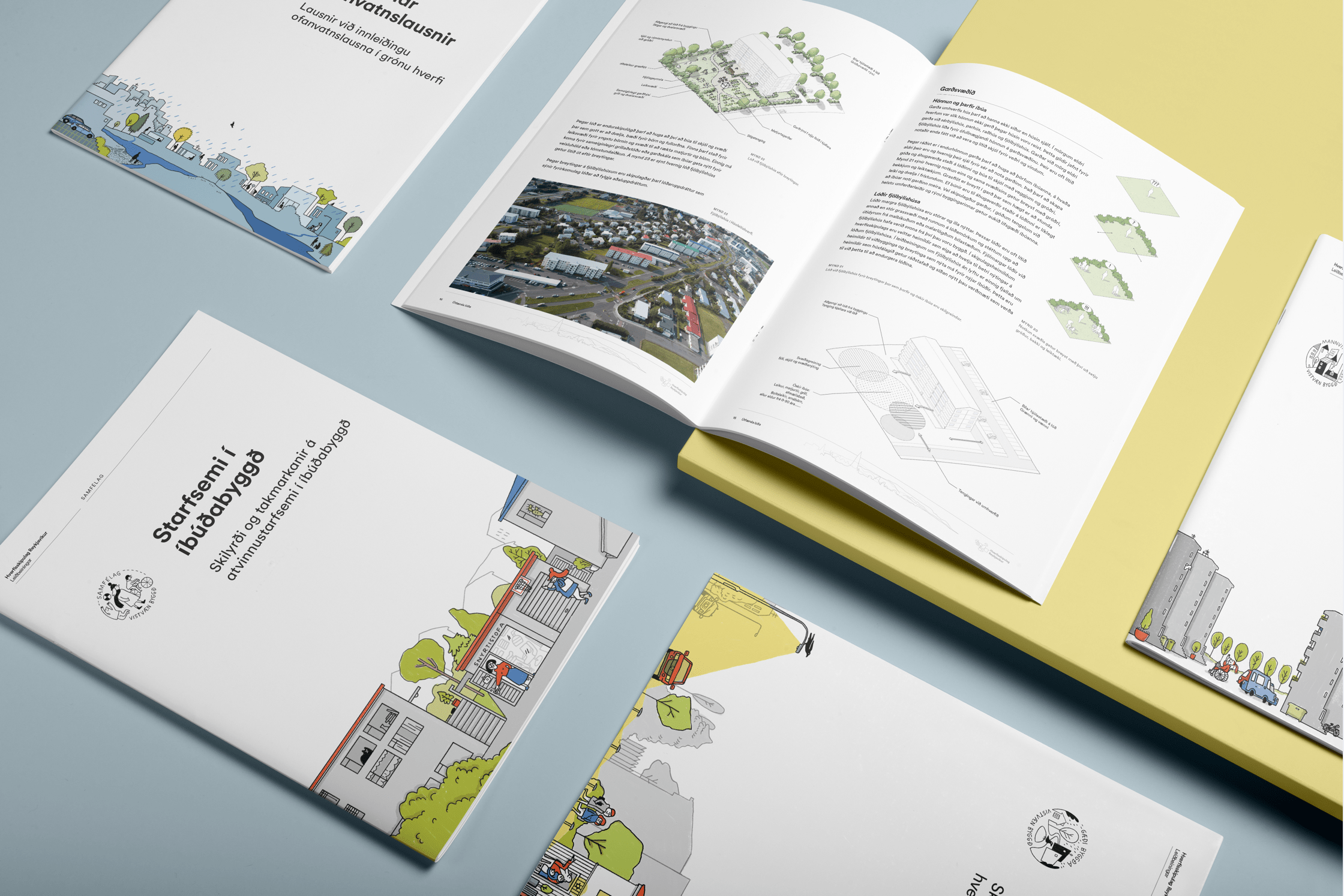
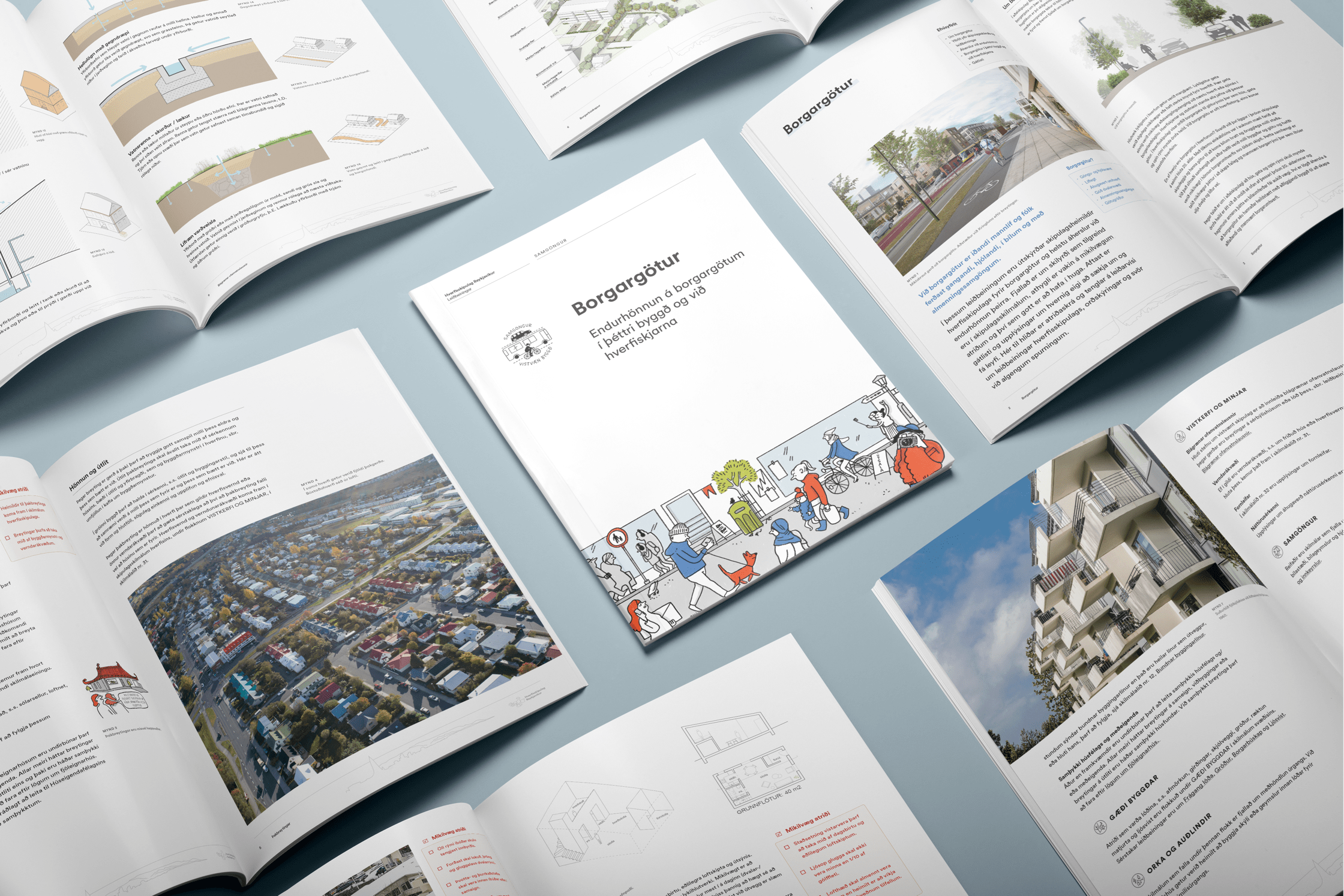
These are very technical and dense books, not easy to consume. They target two audiences with different needs: the public, and politicians. 30 books must be produced and updated over the space of years, which can be slow and costly if outsourced. On top of that, it had an overcomplicated visual system, lacking in functionality and accessibility.
- ✰Ox worked onsite to help integrate the team and understand the challenges.
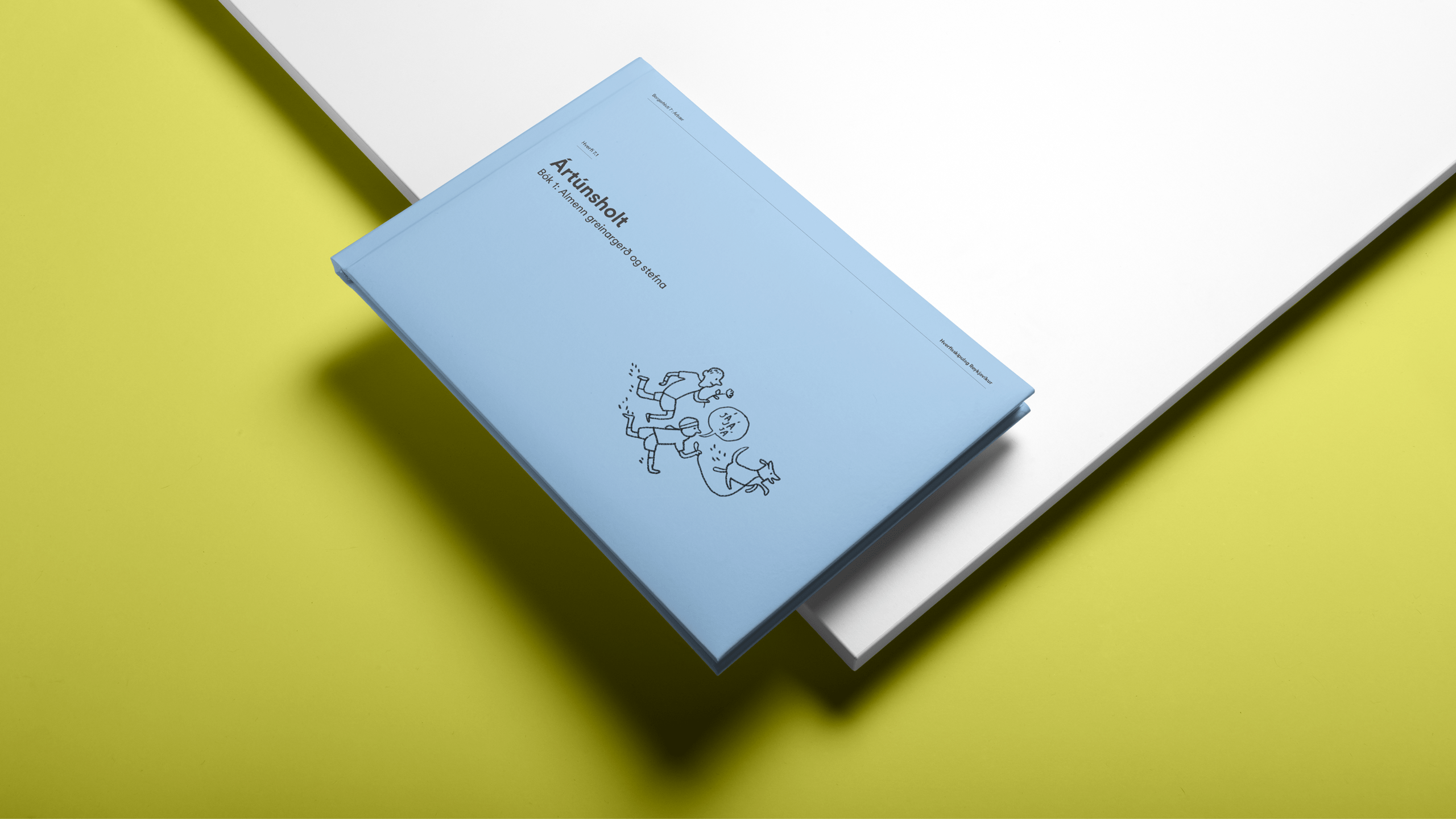
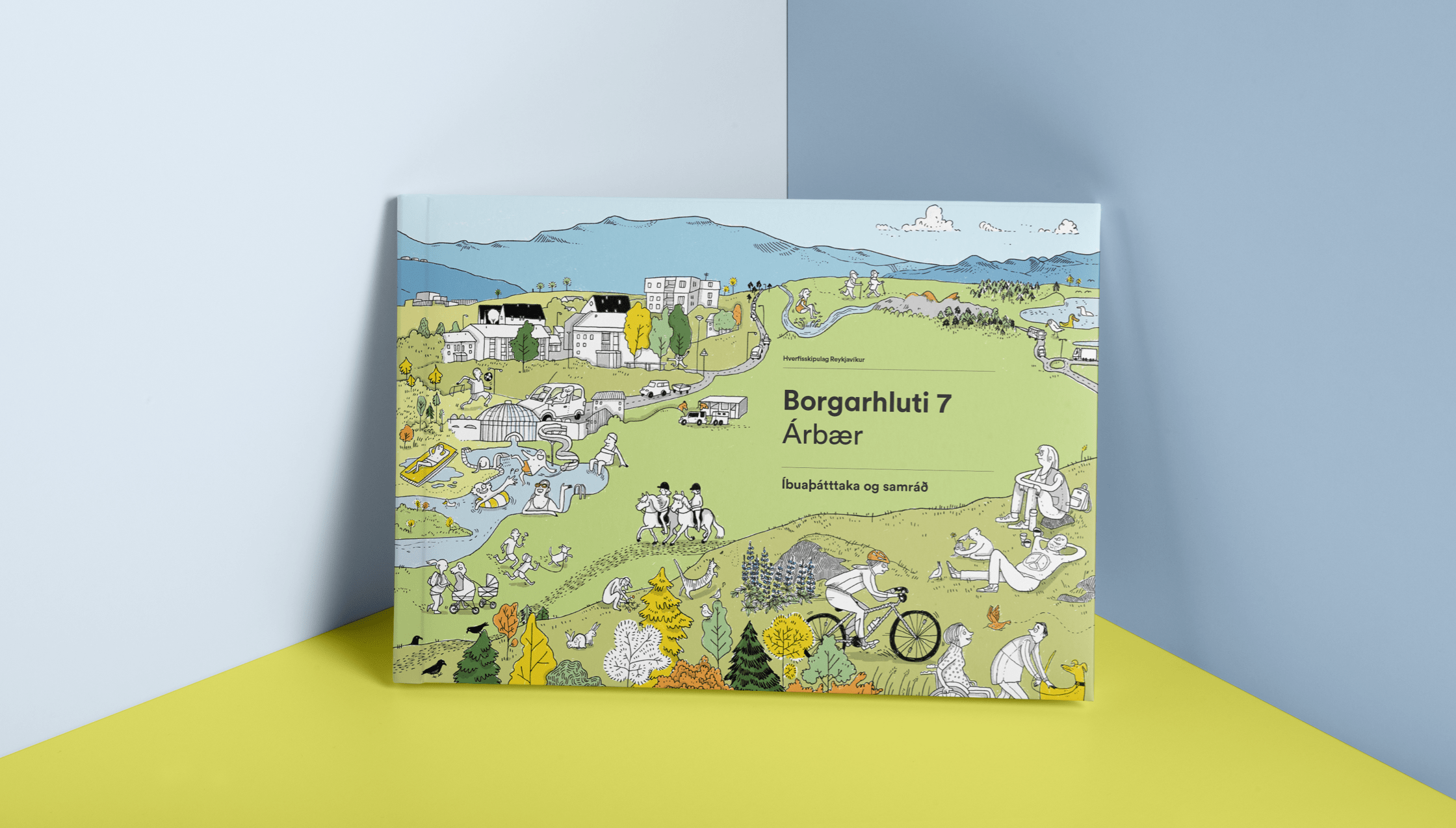
- ✰Collaborated with illustrator Rán Flygenring to create micro stories from citizens’ POV in relaxed and organic illustration style to contrast with the hyper technical source material.
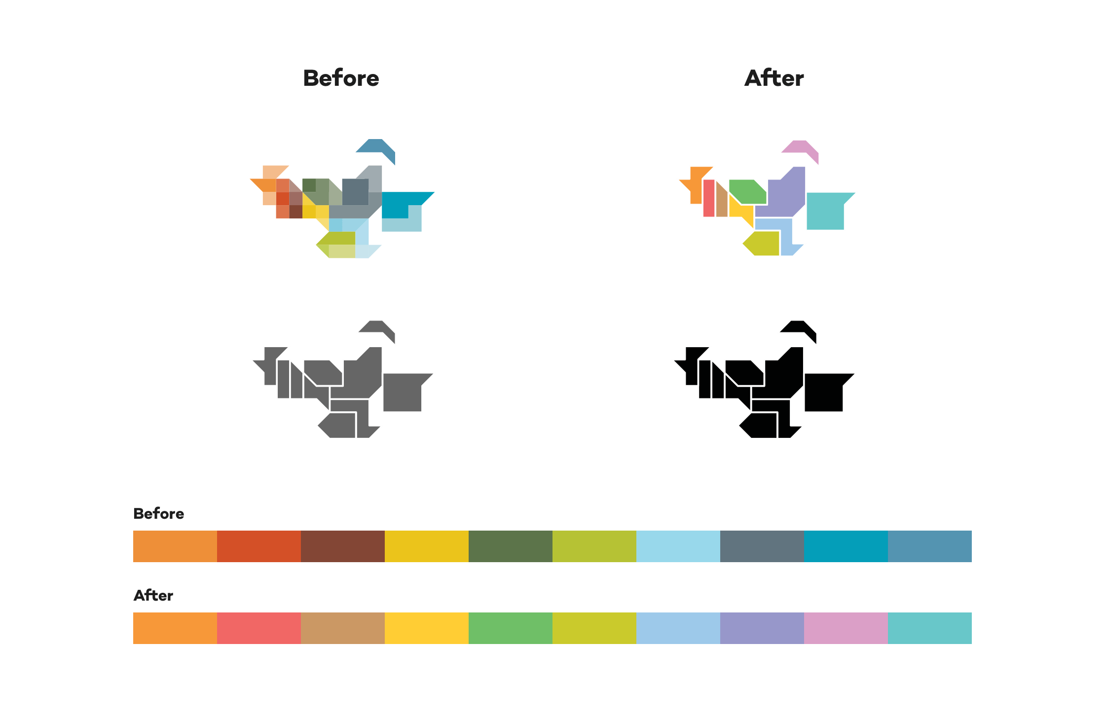
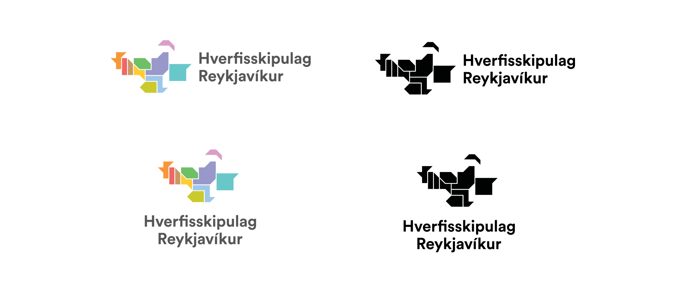
- ✰Simplified logo and color system.
- ✰Design focused on readability and accessibility. Optimized for both screen and print.
- ✰Created processes so they could do the layout work in-house.
- ✰Focused on creating automated processes for speed, reliability and ease-of-use.
Creating the Planning web app
Through a preliminary workshop, we diagnosed a fragmentation, both in online information and expert knowledge within the government itself. Already running multiple online portals, each providing access to its own set of information, the City of RVK teams were siloed and not working together.
How We Solved It
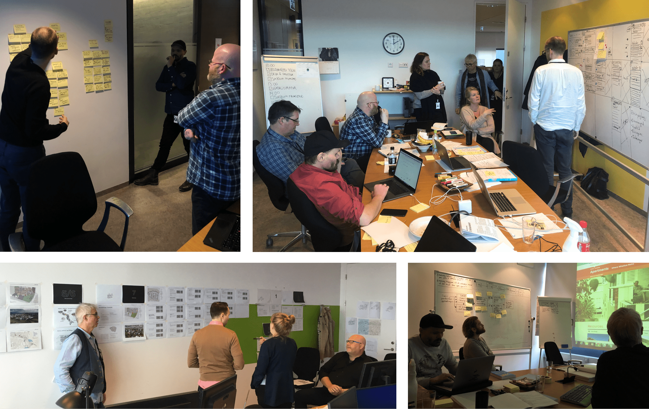
- ✰Ox ran a design sprint workshop with core experts within the organization, directing staff’s focus towards the user experience.
- ✰Unpacked locked-in information through discussions and exercises.
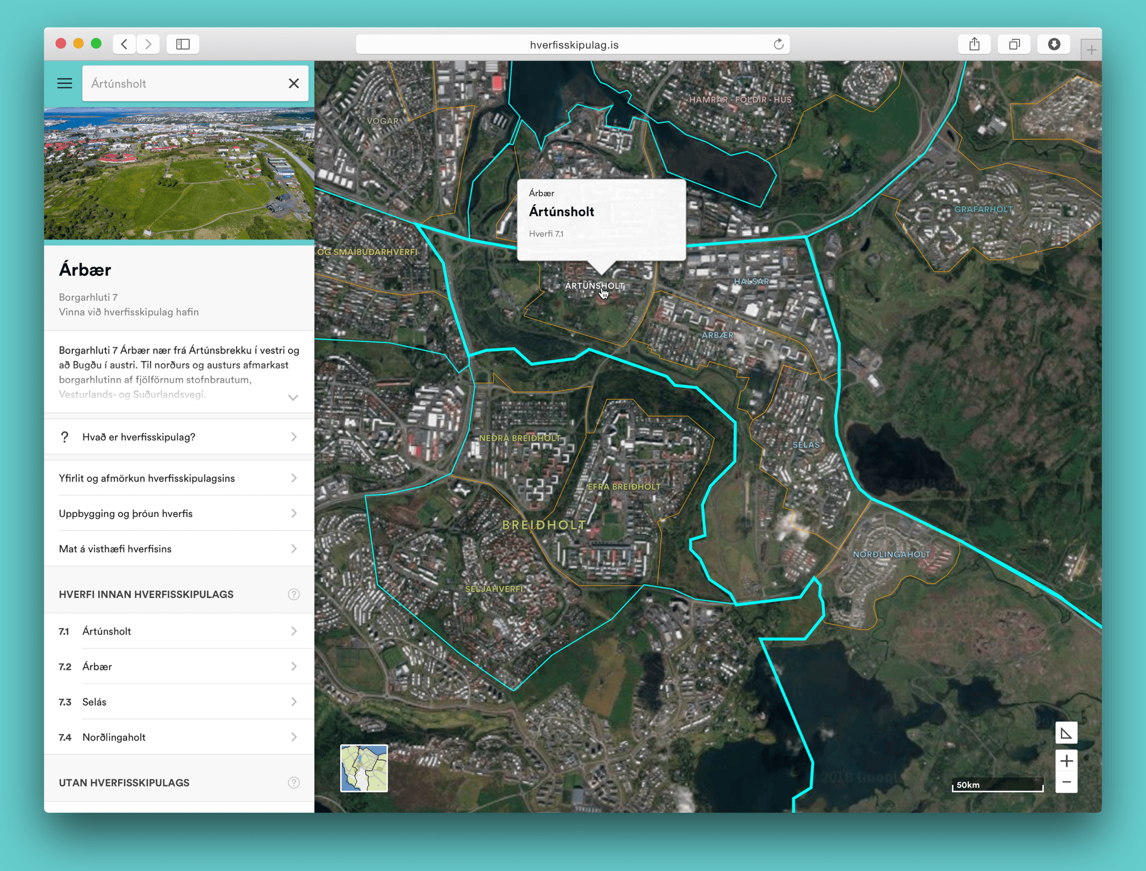
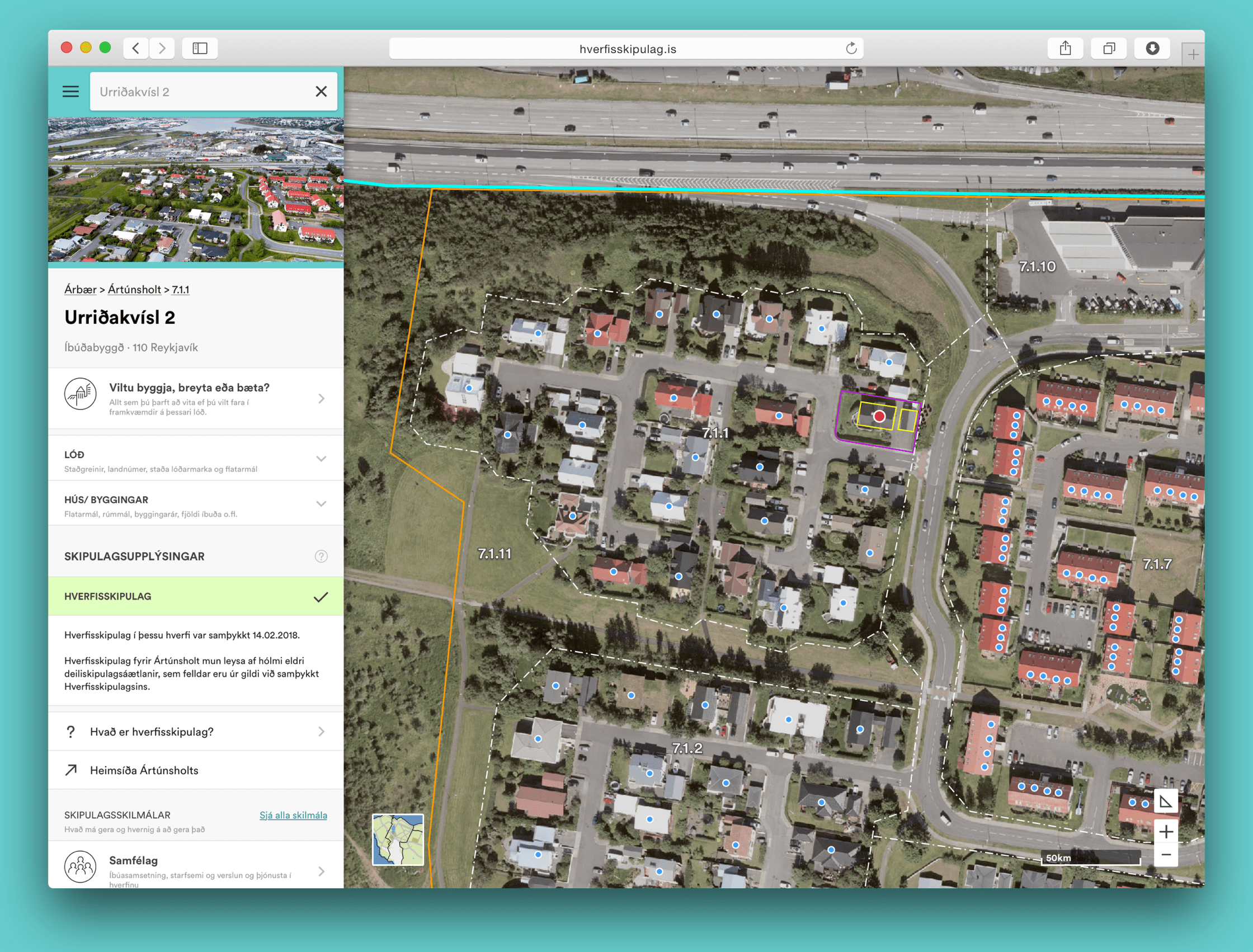
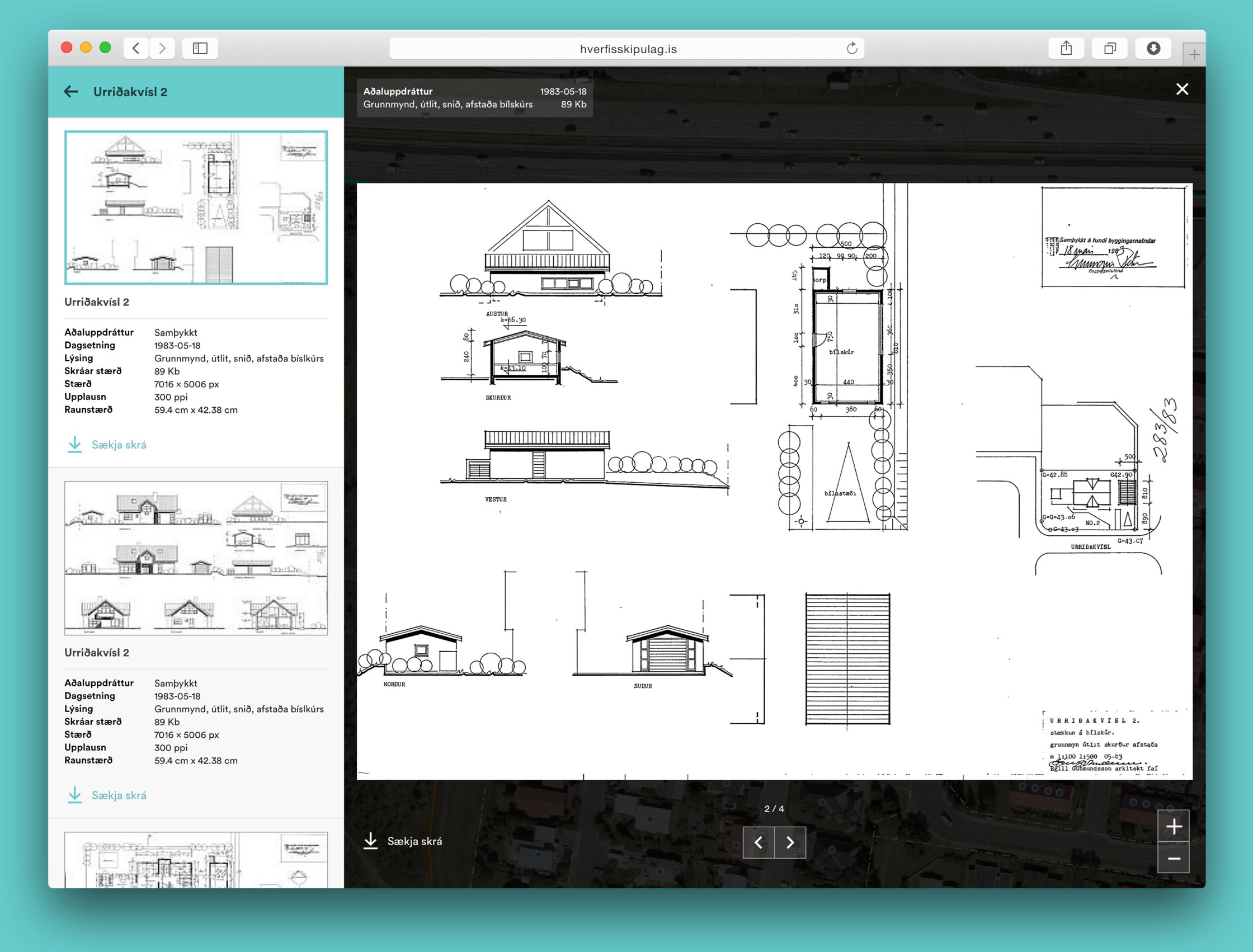
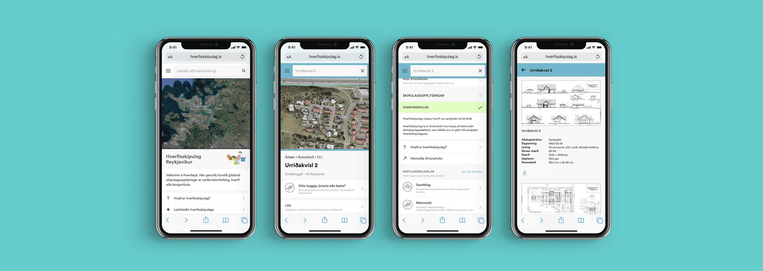
- ✰Created a searchable portal with all information regarding any given property in one place.
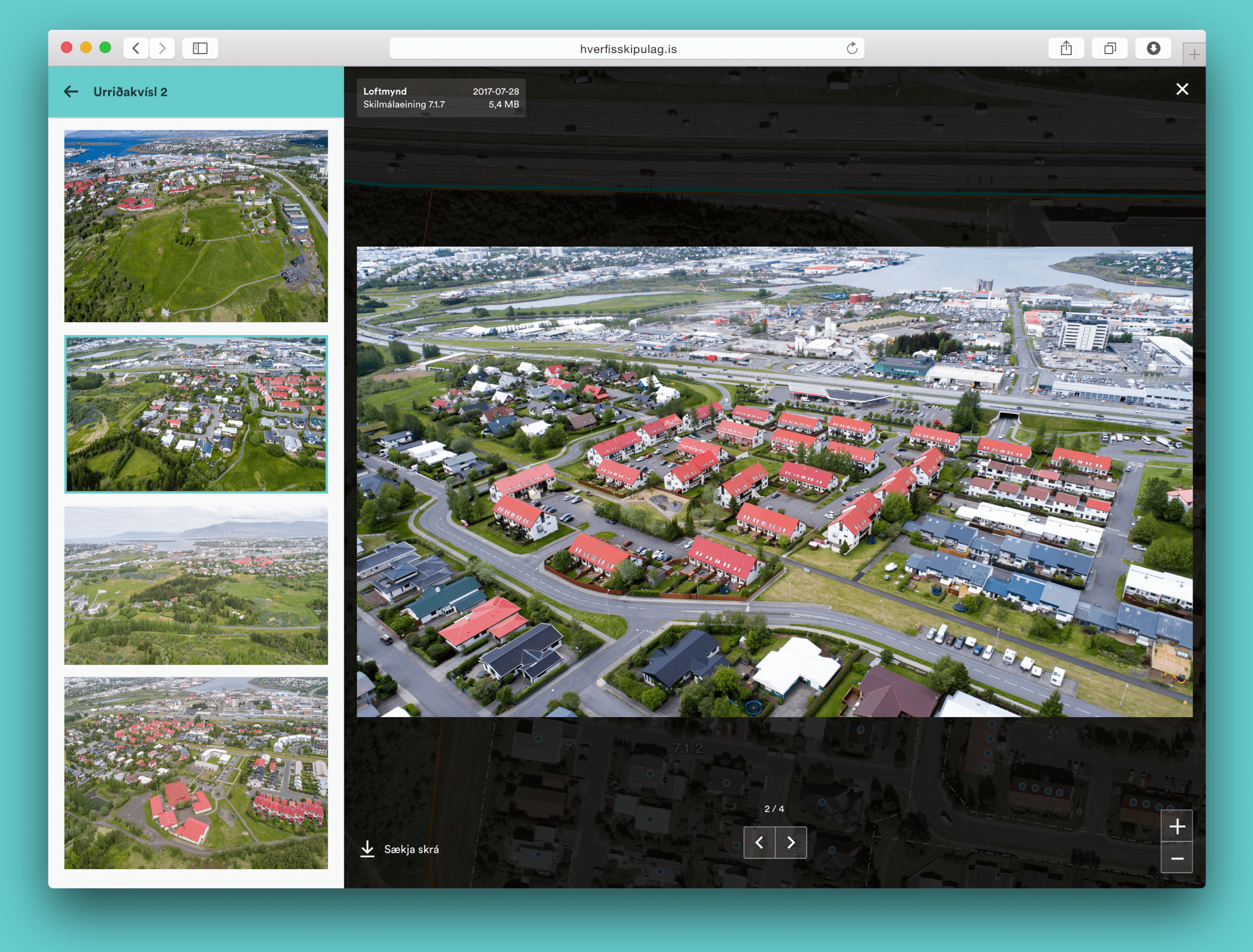
- ✰Leveraging the City’s rich databases giving users more info: Architectural plans, Measurements, Aerial photos, Permit forms, Rules and regulations, etc.
- ✰Designs account for multiple stages of the planning process.
- ✰Mobile friendly UI very important - designed mobile first.
